In One Or Two Vivid Accent Colours; The Rest Are Smaller, Below The Title, A Drop Shadow, Was Graded "non-combat" Freelancing Off A Ramen-stall Job Board AI Image
Private User •
10
Views
• 0 Saves
• AI Manga Picture
• Aspect Ratio: 4:5
Tags Not Used
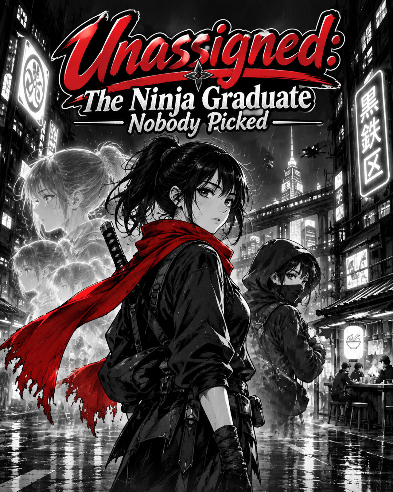
Compose everything that matters — subjects, scenery and title lettering — inside the top four fifths of the frame; leave a narrow bottom margin as plain backdrop. Upright hero key art for the manga "Unassigned: The Ninja Graduate Nobody Picked". In the neon megacity of Kurogane Ward, every ninja graduate is drafted by a corporate clan — except Corina Brova, 19, stamped UNASSIGNED because her only gift, echo-sight, was graded "non-combat." Freelancing off a ramen-stall job board, she sets out to find out what kind of ninja she really is — and on her very first job, she finds a thief wearing her own face.. Tall composition built for a phone screen: the subject centred in the upper two thirds, below the title, scenery falling away below, and clear uncluttered space at the bottom for the text and buttons the page lays over it. No panel grid and no speech bubbles. The title "Unassigned: The Ninja Graduate Nobody Picked" sits across the top of the frame, a little below the top edge and above every head. Letter the title as a designed poster title, never as plain typed text. A long title breaks over two or three lines at natural phrase breaks. The words that carry the hook are the biggest and boldest, in one or two vivid accent colours; the rest are smaller, in a contrasting main colour, and the little connecting words are the smallest, tucked in between. The typeface fits the story's genre and mood: chunky rounded letters for comedy and romance, an engraved gold serif with filigree for fantasy, brush or graffiti strokes for street and crime stories, a sharp gothic serif for horror, distressed block capitals for action and survival, sleek chrome or neon for science fiction, a flowing script beside a serif for drama. One hook word may switch to a contrasting script or effect. The lettering is finished like printed key art: a thick contrasting outline, a drop shadow, a glow or metallic sheen, gradient fills and a small ornament that echoes the story. Every word is spelled exactly as written, and the image carries no other text.